Japs! Dante
Interior
Identity
Communication
Concept
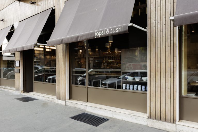
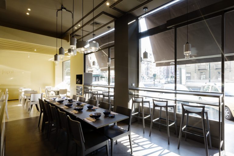
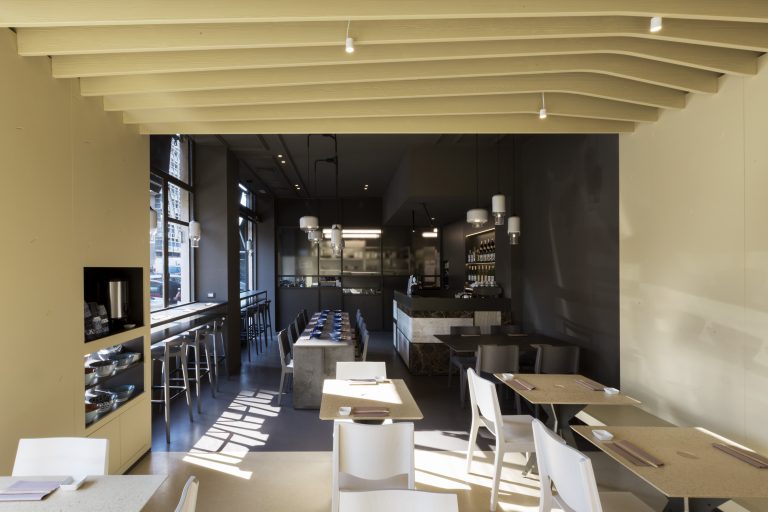
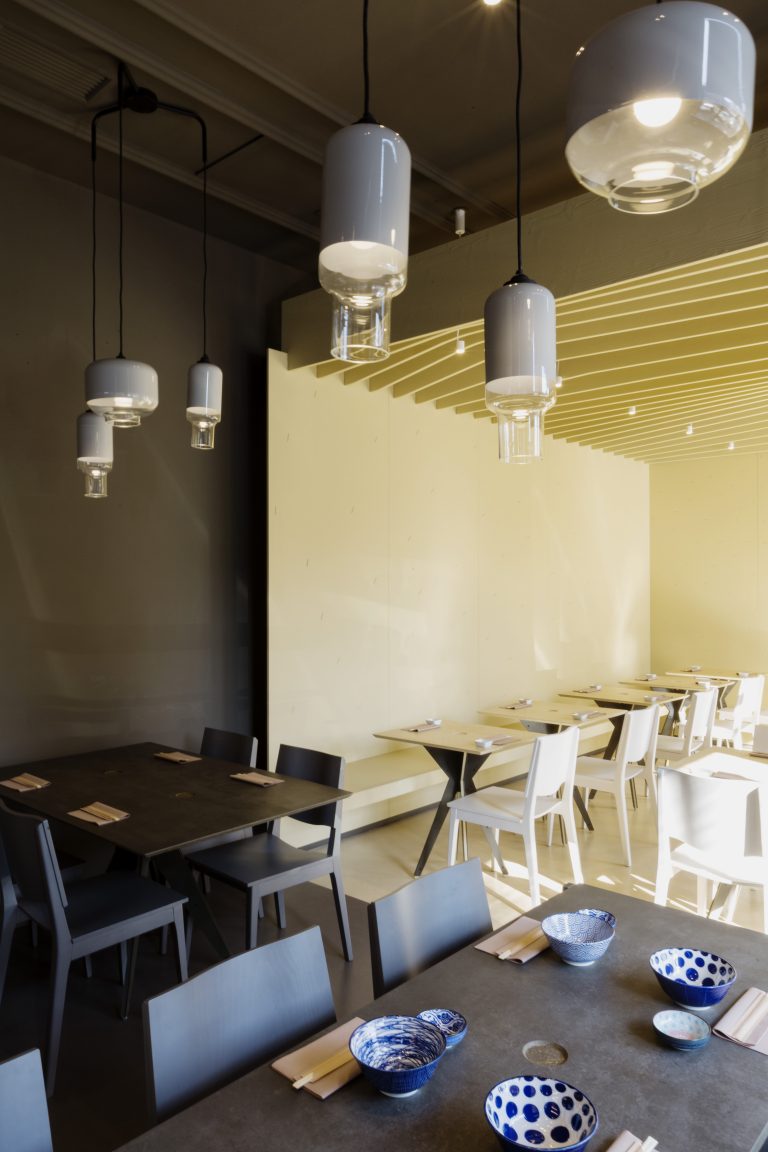
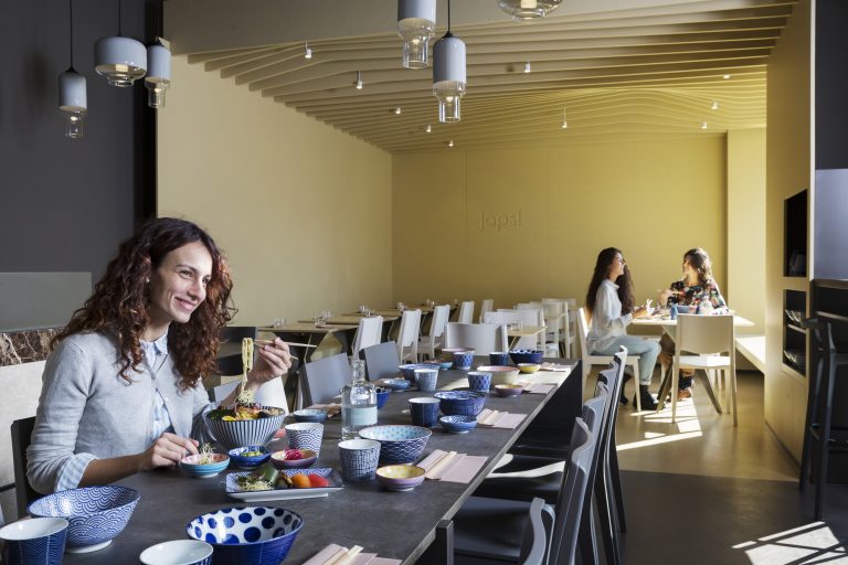
Opposites rule: light and darkness create an ideal separation, so the same space can serve the two souls in Japs! – fast and slow. This was a 360° project that went from interior decor to branding, connecting every aspect: for example, the decorative motif in the logo became a graphic and architectural element, in a relationship of perfect symmetry between image and architecture. Now each Japs! restaurant offers a different Japanese specialty, effectively connoting the chain’s different venues and sparking clients’ curiosity.
Interior
Identity
Communication
Development
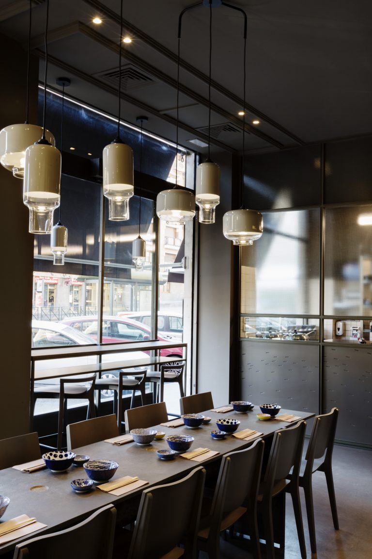
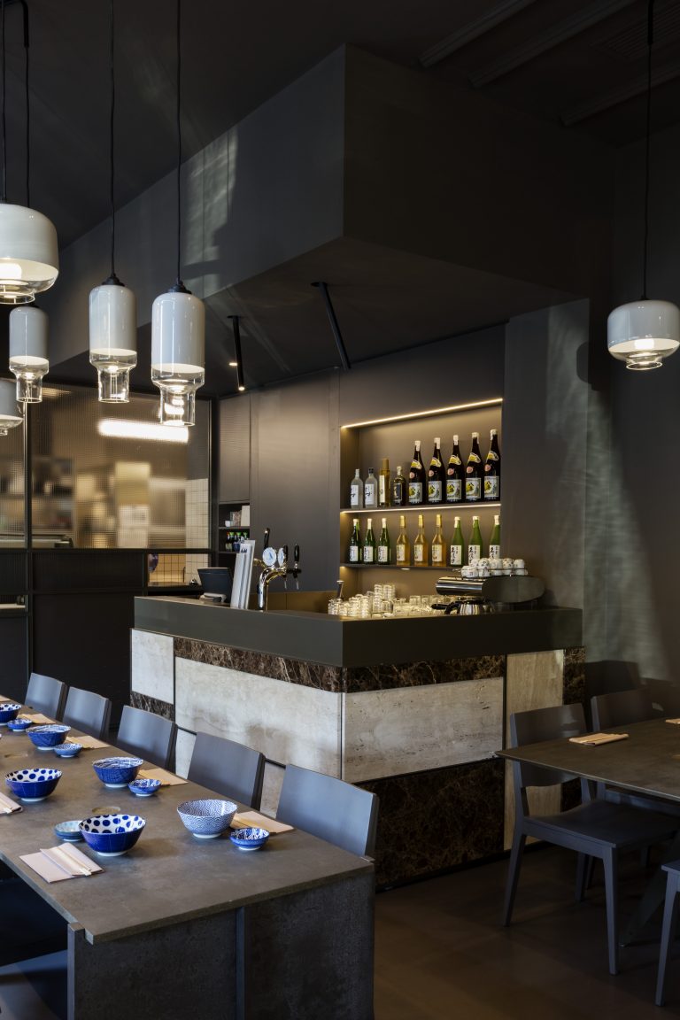
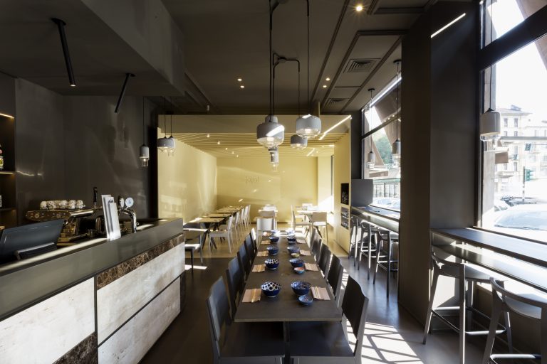
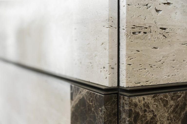
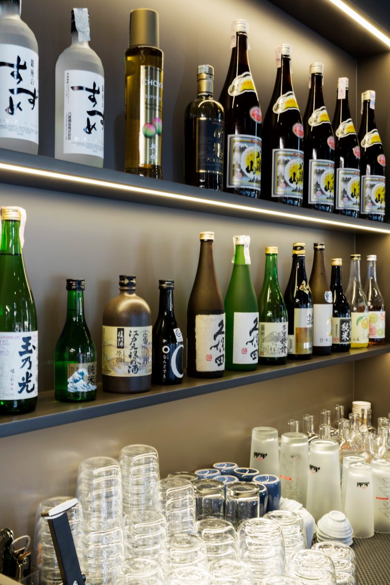
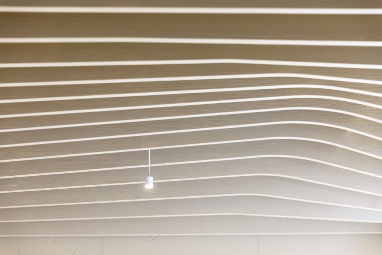
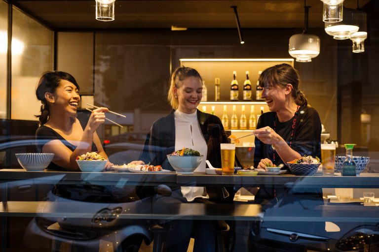
Stone and wood make Japs! restaurants cozy and elegant, so clients feel welcome and stay longer. In the area closer to the entrance, darker colors and wider use of hard materials were designed for informal and quick meals, without table service. Moving beyond, a second area is dominated by light and the wavy rhythm of a blond wood box, welcoming clients who seek a more comfortable and relaxed experience. Within the cohesive decor format, the highlights are the massive counter, shared table for quick meals, and dark panels with watercolor and iridescent hues, created with viroc – an innovative mixture of cement and wood particles.
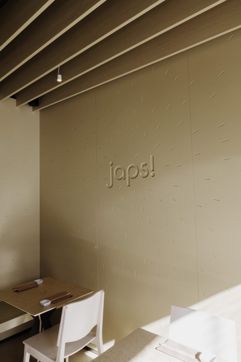

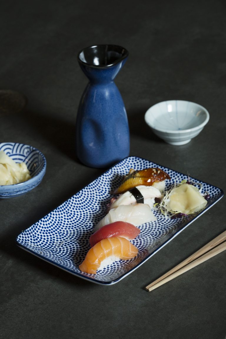

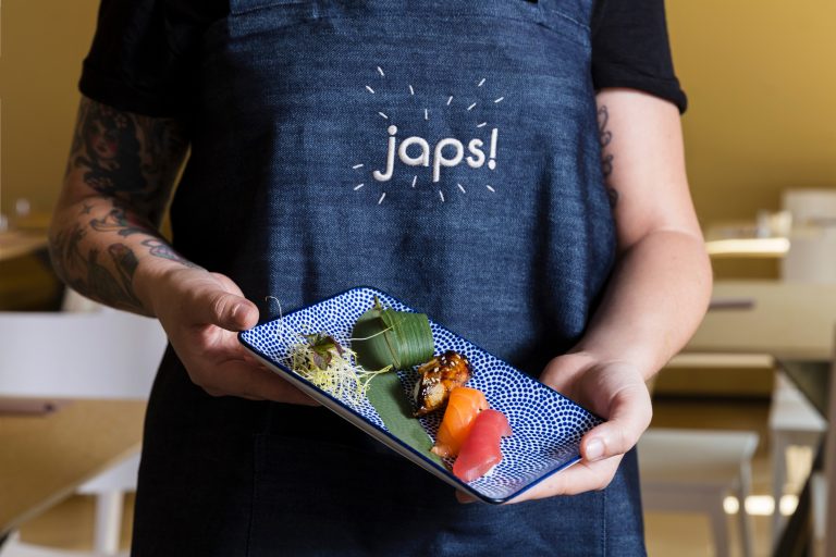
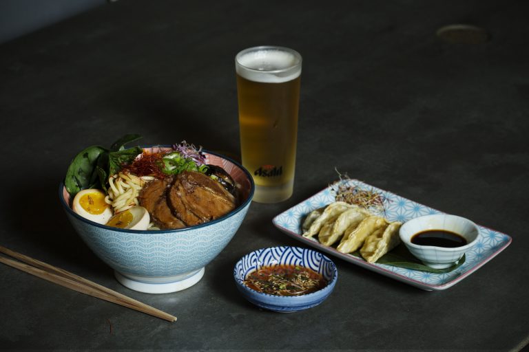
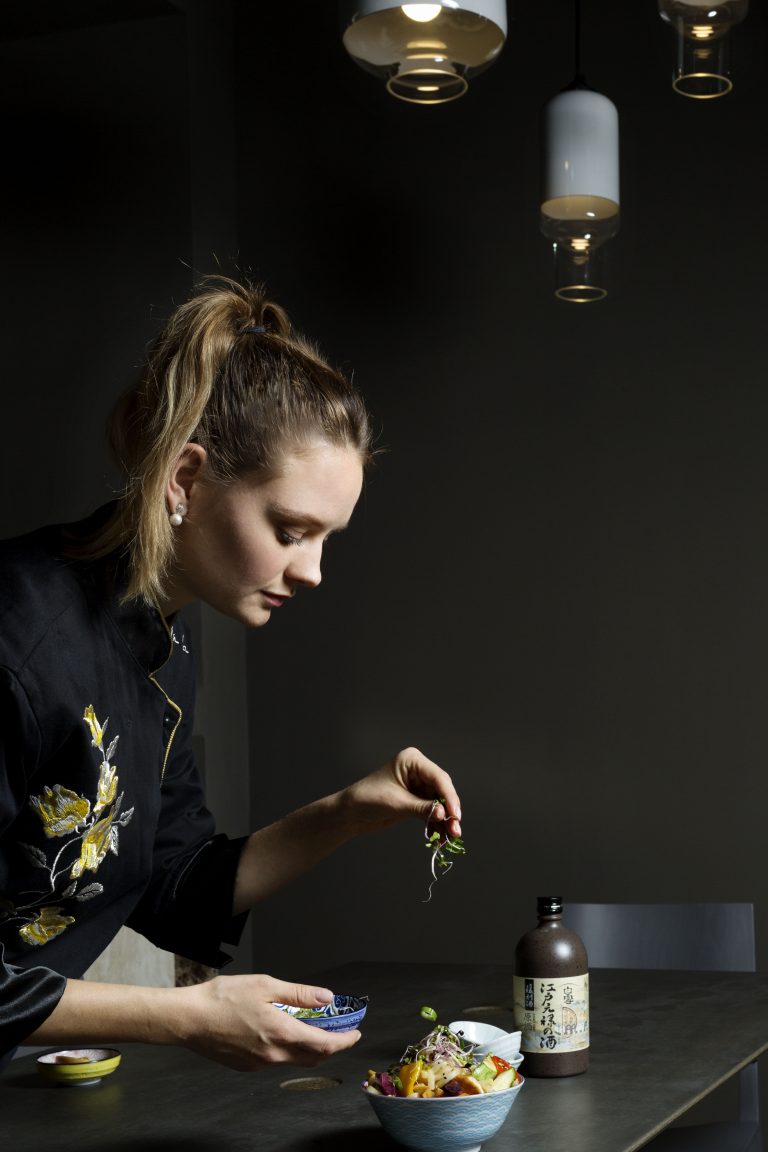
In the new logo version a shower of grains of rice heads towards Japs!, as if it were attracted by the reborn identity of the venue.
CREDITS
LEAD TIME
June 2017 – September 2017
SURFACE
200 square metres
ARCHITECTURAL AND INTERIOR DESIGN
lamatilde
IDENTITY AND COMMUNICATION
DESIGN
lamatilde
PHOTOGRAPHY
PEPE fotografia
VIDEO
Andrea Silvestro
Francesco Ghisi
SOUND DESIGN
Francesco Fantini
Daniele Mana
STRUCTURAL PROJECT
Ing. Marcello Prina
SOUND SYSTEM
Marco Libanore
CONSTRUCTION COMPANY
Hiteco
ELECTRICAL AND HYDRAULIC SYSTEM
Hiteco
DOORS AND WINDOWS
Galliano Elio
SETUP
Talenti
LIGHTING
Elettrogruppo ZeroUno
INTERIOR FINISHES
Sommo Fratelli (counter covering)